Hi everyone!
I bring really good news today. We made a couple of releases, mostly to fix important bugs, crashes, and memory leaks. But yesterday we made release 0.2211.4 which introduces a long-awaited feature, and a UI redesign! Before I talk about that, take a look at this long list of changes shipped in October:
- 🎉 Feature: customize the public feed algorithm
- 🎉 Feature: new top bar color scheme
- ✅ Bug fix: memory leak in the connections tab
- ✅ Bug fix: memory leak when composing a message
- ✅ Bug fix: unable to block accounts
- ✅ Bug fix: back button on the compose audio screen
- ✅ Bug fix: rebuild indexes to fix replication
- ✅ Bug fix: crash related to deleted/blocked accounts
- ✅ (Desktop) Disable asar to fix release builds
- ✅ Bug fix: crash upon malformed about messages
- ✅ (Android) Bug fix: fix input not clearing after sending private message
- ✅ (Desktop) Bug fix: top-left corner quirks on macOS
- ✅ (iOS) Bug fix: margins on the Search screen input
- 🔷 Improve design of message cards
- 🔷 Improve text on the Permanence onboarding screen
- 🔷 (Desktop) Improve UI responsiveness
- 🔷 (Desktop) Inset the MacOS traffic light buttons
- 🔷 Improve app size by 1 MB less
- 🔷 Improve crash reporting to have less metadata
- 🔷 Improve memory usage slightly
- 🔷 Improve translations in Danish, Ukrainian, German, Esperanto, Czech, Russian translation
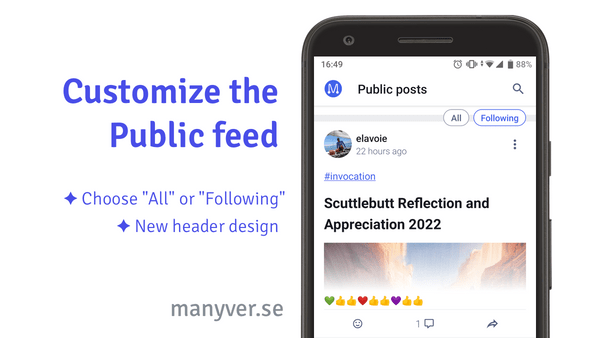
Customize the public feed
Until now, Manyverse's public feed showed any content from people you follow, as well as content from those followed by who you follow. This is not what everyone expects for this screen, because they want to "follow" only those who they explicitly chose to. We've been wanting this feature for a while, but it's been important to postpone it to first get the database working fast and reliably. If you've been following this newsletter for some years, you know things have been getting faster and faster. I think the database is pretty good now!
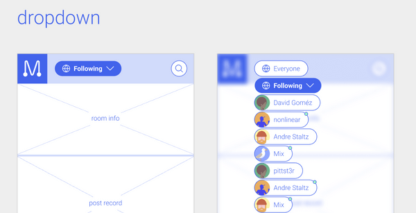
The new feature introduces two "pills" on the top right corner of the Public tab, allowing you to switch between different algorithms. This may seem like a simple feature, but we've been designing this carefully for months. It started out with Nicholas' product design for a scalable way of customizing the feeds. Nicholas made at least 2 iterations and we debated the details in several meetings. Here's one iteration:
As you can notice, we're getting rid of the old-fashioned blue top bar, and making it white. To make it unique and avoid a bland look, we added our logo to the top left. Then, Nicholas passed on the design to David to focus on the visual design, who made another iteration, also after meetings and discussions, that looked like this:
David's design is ambitious because it's about renewing all the colors and icons in the app. It's a long-term goal to implement new looks, but for now we took the basic shape of his design and began implementing it. In September and October, Andrew has been focused on building this new feature, first in the backend and then in the frontend. Andrew approximated David's design into the current app design, and it looked like this:
Finally, this week I came along to polish the final bits for this feature, and together with Andrew we explored a couple of variations. It turns out that you learn new things about a feature only when you try it out for real, using real content. The left-aligned position is good when you're reading the pills, but most of the time you want to read the new threads people are publishing, and based on how western languages read left-to-right, your eyes are often busy scanning the left side of the screen. We ended up putting the pills right-aligned, and without a background, and suddenly it felt a lot more natural, because you can focus on the threads without visual pollution. This is what we ended up with:
I'm very proud of the outcome, and it's awesome to see the path this feature took, weaved by four team members and multiple iterations.
UI improvements
You may also notice from the screenshot above some other new changes. As mentioned above, the top bar is white (or dark in the dark mode) and contains the app logo. But also the threads now have a "share" button on the bottom right corner, while the "..." button got moved up to the top right corner.
These changes also took a lot of iterative design. We actually made 5 or 6 variants where the emoji reactions list was in the bottom middle, or the bottom right. Those variants had some pros and cons, but in the end we chose a variant that is fairly similar to what we had before. What we had before wasn't broken, so we didn't want to "fix" it too much.
Surprisingly, what we ended up with is quite close to how Facebook threads are displayed in the feed. This is entirely coincidental! But this may actually be a good thing for the sake of familiarity when people are looking for alternatives to Facebook and learning about Manyverse.
It also ties with our future plans to improve the "Share" functionality. Nicholas envisions that inviting someone to join Manyverse shouldn't be just about joining Manyverse, it's about bringing someone to read something on Manyverse. In the future, the Share functionality will include an invitation system, so that you can share a thread to someone regardless if they have an SSB app or not. If they don't, then they'll be onboarded to SSB just-in-time. Expect the share and invites aspect to improve significantly in the near future!
Some challenges
This month was also challenging. We had a number of critical crashes to fix, and sometimes when we made a release, the publishing pipeline didn't cooperate and I had to fix things in a hurry.
Probably the worst is that Apple reviewers rejected a Manyverse update, and at the moment of writing, our update is still stuck in review. They claim that Manyverse must implement account deletion, globally and instantly, in order to satisfy App Store requirements. I replied to them that this is impossible because we operate in an open network (SSB) where I cannot control how other devices (potentially with other apps) handle content and permanence. I am not sure what's the future of Manyverse on iOS, and whether we'll magically be accepted again, but this certainly caused some stress and worry.
Also related to content deletion, last month there was some discussions on Twitter on how Manyverse phrases content permanence as a good thing, when it can be a risk for many users. I wrote an article on our blog to clarify my latest thoughts about permanence, and shed some light on our plans in this area. Ultimately, it fits into the Safety theme, and this is a theme we want to pour a lot of effort this year and next year. It belongs to our "Sustainability, Onboarding, Safety (S.O.S.)" goal of rescuing SSB.
I hope this monthly newsletter makes it clear the progress we're making in the app and in SSB in general. We've been doing this for 4 years and it's quite a journey. It got a lot better, but there's so much more we can still do. Thank you for supporting our journey!
– @andrestaltz


