Hey backers!
Thank you for rooting for us! This month's app release is about big bug fixes and small features. (Last month's release was about big features and small bug fixes.)
- 🎉 Feature: show introducer below acquaintance name
- 🔷 Improve indexing performance by 3x
- 🔷 Improve German, Brazilian Portuguese, Ukrainian translations
- ✅ Bug fix: hashtag links inside parentheses
- ✅ Bug fix: crash upon startup, ssb-db2#358
- ✅ (Desktop) Bug fix: some quirks with the migration screen
Show "introducers"
From now onwards, whenever you see an account on the Public tab which you don't directly follow, the app shows a label "Followed by (name)" next to the account.
We're trying to solve a problem of context. On one hand, it's important to have content fetched from the friends of your friends, because this expands the social space and lets you explore more, as well as allow you to create new friendships! On the other hand, when a friend of a friend (which we also call an "acquaintance") shows on your feed, you may not know where they came from and this may feel like an intrusion.
A solution is to help you figure out why Manyverse fetched that account. We want to evolve the specifics of this feature, and the first attempt is to show one of your friends you have in common with the acquaintance. We may change this in the future to be your "closest" friend in common, or to list all friends in common. For now, the first version of this feature brings a lot more clarity to what you're seeing on the Public feed!
Database improvements
Two months ago I wrote about how our "database compaction" project was completed. Recently, I started putting compaction into Manyverse, and ran into a couple of issues. Sometimes indexing got stuck, sometimes there was a problem with the progress bar.
There are two good news here. First is that I solved those issues, with a total of 10 pull requests merged, which means that compaction is ready for production (but not yet deployed in today's version). Second is that while fixing those issues, we happened to make the database faster.
Indexing is now more than 3x quicker. To put this into perspective, it used to take me about 10 minutes to index my database, now it takes less than 3 minutes. This is massive! As a reference, Patchwork takes almost an hour to index all the content.
This puts us realistically within reach of achieving the goal of "1 minute initial sync", because once we allow deleting blocked accounts and old content, the total size of content to be indexed will decrease. This naturally leads to less time spent on indexing.
Storage management
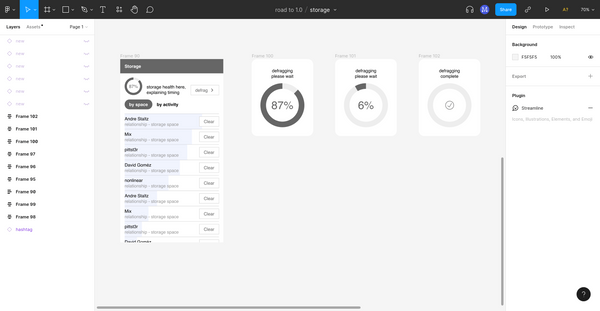
Speaking about deleting accounts, Nicholas Frota worked on a design for a new screen where you'll be able to see how much storage each account is taking on your device, to delete any accounts you wish, and to "compact" or "defrag" the storage. The design is complete, and Andrew Chou began implementing it, starting from the logic that calculates how much space each account is taking.
We believe it's important for users to understand that all the content they are browsing is in fact locally stored on device, such that undesired accounts are also taking up space. Most users are already familiar with pruning storage on their phones once they are running out of it. Users typically delete unimportant pictures and videos to make space. We want those same effects to happen on the social network: pruning your social surroundings, keeping what's worth keeping.
News from the Batts team
Most of my time last month was dedicated to the private-groups team, and we have a lot of progress to report. Design efforts by Nicholas have mapped out the different user flows for joining groups, ssb-db2 was thoroughly refactored to separate "feed formats" from "encryption formats", and we began designing how groups should be structured as metafeeds and how they should replicate.
If you want to know more, we are keeping a team diary thread on SSB, which you can read on the web here or browse the SSB thread directly, at %TIddJIPkn0JmTQG/Ao7gMiSsaVhzx1QC3+QDLuQnhFQ=.sha256.
Designing a new main menu
If you regularly use Manyverse, then you are familiar with some of the pain points, such as not having a way of subscribing to threads you're interested in, not being able to browse through recently active hashtags, not being able to customize the Public tab, etc. We are also keenly aware of this. The solution isn't just to put in new screens for those things, because on mobile you quickly run out of space on the screen. In fact, we also need to add "Groups" into the mix, when we're ready to deploy private-groups.
This required a redesign of navigation in the app, and a new main menu. Nicholas, me, and Dave Gomez met a couple of times and started working on a redesign. We mapped the space, we made wireframes, we made completely different wireframes, and we're approaching something we really like. I don't want to commit to telling all the details yet, because we're still figuring it out and may change the design a lot. But what I can tell you is that we'll have categories and subcategories, and the new design will allow you to navigate very easily to subcategories, save or pin those subcategories. It's a design that is general enough to accommodate all our screens, and we like the flexibility. We are also going to get rid of the blue ("indigo") background on the top header, since that seems like an out-of-fashion design choice.
Lots of changes going on, and they're coming out soon! Thank you so much for supporting us.
– @andrestaltz

