Hey backers,
It may sound strange that Manyverse has been at version "zero" ever since it launched. Our releases so far have always been "0.YearMonth.Day", for instance, the latest 0.2112.3. That's not going to be the case forever. One day, version 1.0 will happen.
I'm inspired by how Blender (a free and open source 3D graphics program) has thrived for decades. Blender remained two decades in version 2.x, and they now just released Blender 3.0, a huge step forwards.
Manyverse aspires to be like that, always improving, and once in a while creating breakthroughs. Manyverse 1.0 will launch when it's ready for mainstream, when it's easy and intuitive for anyone to use, as well as (socially) safe and (technically) stable. If we are honest, we are not there yet. But we're making progress, and this month's release is about improving easy of use in one of the parts that has been a constant source of confusion: Connections.
Version 0.2112.3 presents:
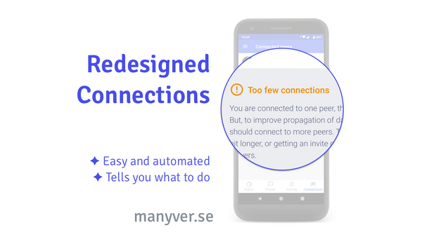
- 🎉 Feature: new Connections tab recommends you what to do
- 🔷 Improve how internet presence is detected
- 🔷 Move out connections tab to its own screen
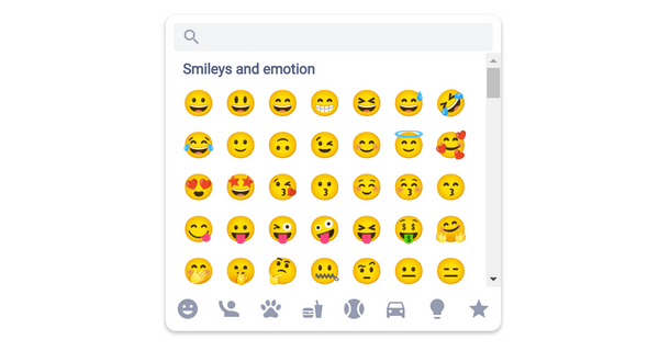
- 🎉 Feature: new emoji picker for reactions
- 🎉 Feature: emoji-react with your favorite emojis
- ✅ Bug fix: text in posts should be selectable
- ✅ Bug fix: friends on the same Wi-Fi should show up
- ✅ Bug fix: translate Backup screen "Data" title
- 🔷 Improve French translation
Connections are one of the parts that makes Manyverse unique. Most social apps hide from you the metadata on which servers you are connected at the moment, because it's always the same servers owned by the corporation, constantly tracking your activity. In SSB, servers are interchangeable and transparent resources owned and managed by the community, and the user should have full control over who they are connecting to, emphasizing relationships of trust.
It's somewhat easy to design UI and UX for posts, reactions and replies, because those are common in many social apps. But there was nothing similar to Connections out there to draw inspiration from. Designing it was difficult. Until now, this Connections tab has confused people, because it just displays a bunch of peers, they pop in and out irregularly, and it's not clear what you should do on that screen.
Last year, a friend of mine (and one of the backers on this OpenCollective) gave me a great idea to improve that screen: make it automated and reduce the amount of information and input it requires from the user. The new Connections tab gives you a simple diagnosis of your current connectivity state, and if it's impaired, presents step-by-step recommendations to improve it.
The Connections icon on the bottom is also a good summary: it's now a gauge that goes up when the situation is good, and down when it's bad, and if it stays bad for too long, calls your attention with a red color. Your attention is a delicate life-resource that belongs to you, so Manyverse asks for your attention only when it really needs it in order to keep the app serving you well.
Give it a try, and if you have feedback about it, remember you can schedule a video call with me.
Detecting internet presence
Related to the Connections tab, we now detect whether you have internet connection in a different way. Previously, we used a hack: ping (CloudFlare and APNIC managed) 1.1.1.1 or 1.0.0.1 or Wikipedia or IETF. It was weird, I know. But it was a very reliable way to do it, across all operating systems. We changed it because detecting internet presence is not that important for the new Connections tab anymore, and also because F-Droid flagged us with anti-features which we'd like to not have. We now use connectivity APIs provided by Android and iOS and Electron, which work well enough for our purposes. See it open sourced as react-native-has-internet. As a bonus, we simplified our privacy policy even more, and it's now clear that the app does not send out any metadata to any hard-coded server.
New emoji picker
Choosing emoji reactions is way nicer now! We show all emojis in a familiar scrolling box that resembles the ones in your mobile operating system, and there's a search bar there too. This is built for Manyverse first, but we open sourced it separately as react-native-emoji-modal so it's useful for other folks too.
Plus, the quick emoji picker displays your top 7 favorite emojis.
What's next? Top priority is finishing the desktop app. Let's go!
Happy Holidays and see you in 2022,
— @andrestaltz

