Dear backers,
I hope you're having a good start to your holiday season! To the new backers in this OpenCollective, welcome to this newsletter! We send this by email on the 5th day of every month, packed with information on what progress has been done in Manyverse recently.
New release
Today there's a new version of the app available on the app stores. On Android, you can also download the APK file directly from manyver.se/apk ('indie' release). For those of you who prefer F-Droid, I kindly ask for more patience as we try to figure out the build server obstacles with F-Droid. Version 0.2012.5 brings:
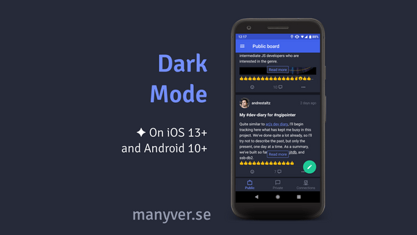
- 🎉 Feature: dark mode
- ✅ Bug fix: profile screen layout when you block someone
- 🔷 Improve colors and style of unread content
- 🔷 Improve the color palette
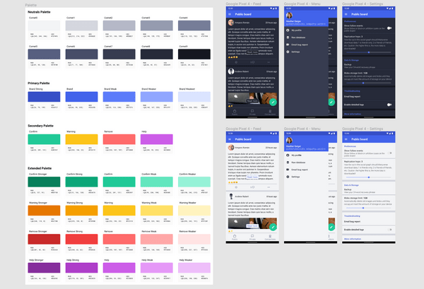
Many of you have been asking for a dark theme, and here it is! David Gomez and I collaborated on rethinking the current color palette in a way that accomodates both light and dark themes. In this new release, the theme inside Manyverse will automatically match the theme you selected in your operating system — only supported in recent iOS versions and Android 9+ — so there's no additional setting to choose. For those of you on older versions of Android, we plan to add a setting in the app to choose the theme in the future.
I was impressed with David's initiative to redesign the color palette and the UI, he prepared a beautiful Figma document. See a screenshot of it below:
We also shipped a few UI tweaks in the app related to the palette, such as a new style for the "unread message" indicator. Previously, an unread message or thread would have a distinct light blue background. Now, the timestamp of the message is highlighted in bold and green when the message is new and unread.
New database
Another thing shipped in this new release is imperceptible, yet an important milestone: a new database that will allow us to speed up the performance of the app. Most of my time in November was dedicated to building ssb-db2 and JITDB (a component inside ssb-db2). For context, see my pull requests: #18, #10, #28, #39, #52.
So far, this only means that we are preparing the app to be migrated from ssb-db to ssb-db2. In reality, we are still relying on ssb-db for everything. What ssb-db2 currently does in Manyverse is just migrate the "log" (the heart of the database), moving all user data from the old format to the new format. This means that when we're ready to actually switch to the new database, the underlying data will be ready for the switch.
Since this work was part of the NGI Pointer grant (read about it in October's newsletter), we've been putting a lot of effort into it, and the progress has been fast. I believe we will do the switch to ssb-db2 quite soon, maybe in the next release. This means that the app will soon get faster, for both current users and new users experiencing initial sync. Reminder: our goal is to solve the user experience when onboarding.
UX project — prototypes
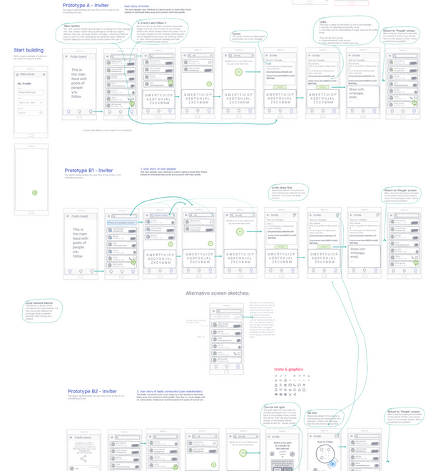
Also regarding onboarding, we've been doing progress in the UX Project "Welcome to the Manyverse" (read more about it here). Wouter has begun interviewing candidate users and collecting information to prepare prototypes to test our potential solutions to make onboarding simpler to understand when one person is inviting the other. The three of us, Wouter, David, and I, got together in some meetings to build low fidelity prototypes using Invision, see a screenshot below:
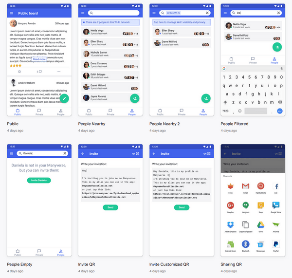
Then, based on those, we built high fidelity prototypes that are actually interactive, and we used those in interviews with users to gather feedback on their perception of how the apps works, see the screenshots below:
As you can maybe see from the screenshot, we plan to replace the Connections screen with a new "People screen". Overall, we've learned a lot in this process, we already got early conclusions that seem promising to implement later in the app.
Coming up
In comparison to other SSB apps like Patchwork, Manyverse is still behind, lacking essential features such as search, listing your mentions, hashtags, and so forth. The main reason I've been postponing building those is that I know each new feature added would make the app slower, due to more database indexes.
Now with the new database being built, I'm confident that we can support those features without significant performance drawbacks. I can't wait to make this happen and bring many new features to Manyverse! I'll keep you informed in this newsletter, and I gotta say 2021 is looking very bright for this project.
Have a great end of year!
— @andrestaltz


