Dear backers,
March 2020 was likely a difficult month for all of us, as the pandemic hit hard in multiple locations around the world. I sincerely hope that you have been safe and healthy, as well as your close friends and family. I too have been spared from the virus so far, and I hope we can all return back to normal soon enough.
Last month for Manyverse was rather normal, gladly. I am thankful that many of you (100 backers) decided to continue supporting financially the project during times that aren't the easiest, financially. In app development, this was a good month: 68 hours worked, 36 hours funded, 5 bug fixes, 1 new feature, and 2 improvements.
- 🎉 Feature: emoji reactions instead of likes v0.2004.4
- 🔷 Improve typography and styling in markdown posts v0.2004.4
- 🔷 Improve UI performance slightly v0.2004.4
- ☑ (iOS) Bug fix: reduce menu icon opacity on scroll v0.2004.4
- ☑ (iOS) Bug fix: Save button and others should be pressable v0.2004.4
- ☑ (iOS) Bug fix: top bar opacity animation v0.2004.4
- ☑ Bug fix: splashscreen sometimes got stuck v0.2004.4
- ☑ Bug fix: typo in the backup instructions screen v0.2004.4
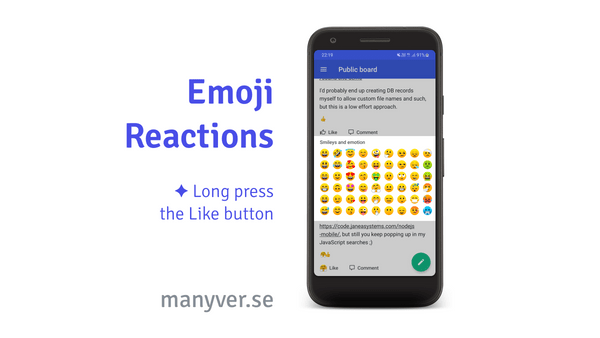
The main new feature this month was at the top of our roadmap: emoji reactions.
Scuttlebutt (SSB), being a technology that embraces subjectivity and attempts to reduce social media addiction, doesn't resonate well with a single option for "liking" and a counter of likes. It should enable more expressivity, and should de-emphasize numbers. For quite some time, people in the SSB community have discussed de-emphasizing likes. Emoji reactions in Manyverse addresses that.
The like button still works as usual, but now you can hold your finger on the like button to open up a selection screen of different emojis that will replace the typical thumbs up reaction. This is familiar from other social apps, but what's different is that we don't show any numbers of total reactions. Instead, the reactions just stack up. We're still thinking about the design of this interaction (see this issue), so if you have ideas how to improve the look and feel of it, let us know. Give the feature a try! You may notice that old posts will show likes as either hearts or thumbs up or "V-shape fingers", this is because SSB already supported different reactions in the data layer, and different apps have different default reactions.
To develop this feature, there were quite a few refactors done, some that improve UI performance as well, as well as some new open source libraries such as this fork of react-native-emoji-picker. I am very thankful that we have a new volunteer, David Gómez, actively contributing code and ideas to the repository. Collaboration with him resulted in some of the performance boosts for version 0.2004.4.
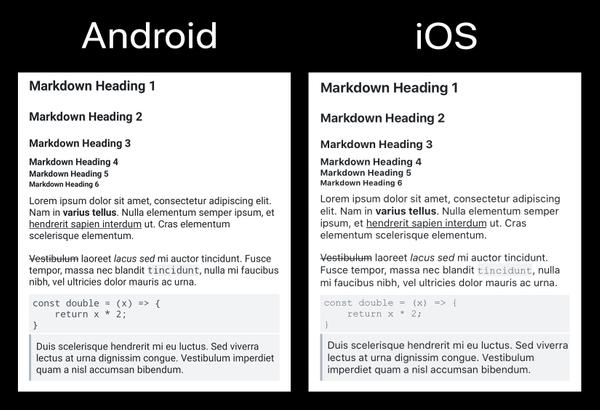
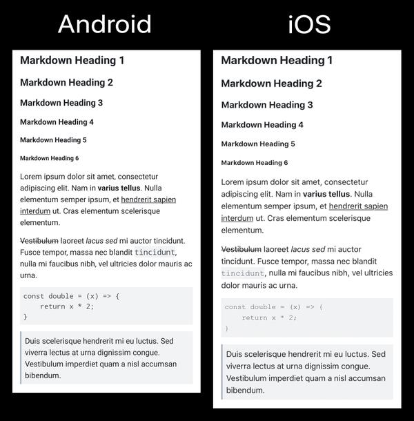
David is interested in polishing the UI of the app, particularly on iOS, and one such improvements he made has already been shipped: typography and styling fixes for markdown. See the comparison images below:
Before:
After:
Other people have tried to contribute code to Manyverse in the past, but turned away when realizing it was too hard to grok the codebase. That's very unfortunate, and it's my fault. With David Gómez, I decided to get on a video call and answer questions about how the codebase works and is structured. We recorded it, so you too can watch the screencast on YouTube! This is also linked in our docs, and should make it easier for other contributors in the future.
Last month's Settings screen was the last milestone for our NGI Zero funding from NLnet, and I'm super thankful for this successful partnership with NLnet! It went according to the plan, plus, just a few days ago, NGI published a blog post about humane technologies that help stay in contact during this coronavirus crisis, and it mentions Manyverse alongside others. Check it out!
Thank you, friends,
— @andrestaltz


