Dear backers, here's another monthly update on the progress of our project. Since the last newsletter, over a thousand people installed Manyverse for iOS, and there has been a significant boost in donations to the OpenCollective. Thank you, and welcome new backers! There are now 90 backers. In January, you funded 36 hours of work, which is a milestone because it represents 1 week of funded work per month! I worked 84 hours last month, to bring you some exciting features. Version 0.2002.4 was released today on Android and iOS, bringing:
- 🎉 Feature: private messaging
- 🎉 New layout with bottom tabs and more space to read
- ☑ Fix how replies reference previous messages in SSB
- ☑ Bug fix: do not crash on startup due to faulty conn-db
- ☑ Bug fix: searching people to mention is case-insensitive
- ☑ Bug fix: visual glitch in the connections tab
- 🔷 Improve how peer connections are scheduled
- 🔷 Improve loading animation at start up
- 🔷 Improve the updates indicator for the public tab
- 🔷 Improved dynamic icon for the connections tab
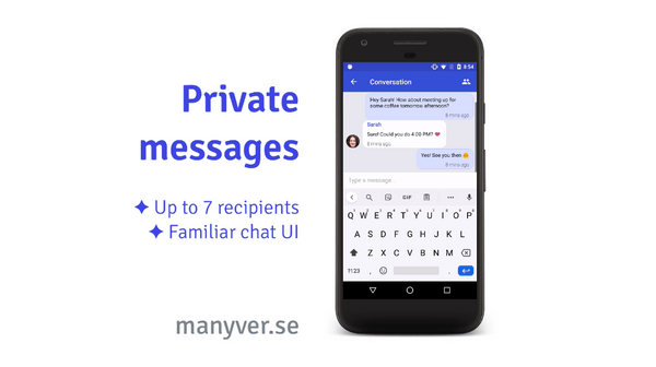
Let's talk first about the main new feature this time: private messages. So far, Manyverse has been an app with one primary type of content, the public feed of threads and comments. Private messaging adds an entirely new dimension to social interactivity in your community. You can find it in the middle tab button. Private messages can be addressed to groups of maximum 8 participants (including yourself). Content is end-to-end encrypted, and is compatible with other SSB apps like Patchwork and Patchbay. The interface is neat: it mirrors the common chat interface that you are already familiar with from other mobile apps.
Give it a try! Many of you who are long-time SSB users might be surprised to see that you already have some private messages in your inbox. They were already posted in the Scuttleverse, but only now they are "unlocked" (decrypted) and made visible in your app. This might be a fun surprise. :)
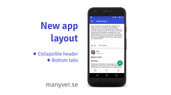
The next big change is a new layout for the main screen in the app. Previously, the tabs were at the top, and they stayed fixed even when you scrolled. This turned out to take a lot of precious screen real estate. In the new version 0.2002.4, the tabs are located at the bottom, and the top header dynamically hides while you scroll. This is a sleeker design, giving more space and focus to the actual content.
The tab icons are also a bit different. One design principle I've been following for Manyerse (influenced by sociotechnical designs in SSB) is "Pull, not Push". This means that the user is in charge of pulling data updates, as opposed to data being pushed to the user. The goal is to put the user in charge and to avoid addiction-inducing features and attention-grabbing. One example of this design choice is that Manyverse does not have push notifications, and it's not in our roadmap. We might, one day, add opt-in push notifications.
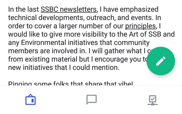
In "Pull, not Push" spirit, I decided to get rid of dots and number badges, those small out-of-place indicators that show when there is new content for you. I tried to go for visual indicators that don't pop out. Notice the screenshot below:
The Public feed icon is a bulletin board, and instead of having a dot near it, the icon itself varies over time as updates come in. The more updates, the more "full" the bulletin board becomes. In my own tests, I realized that this helped to reduce the anxiety of new updates and make the bulletin board become a visual target that I choose to inspect whether there are new updates. The same principle applies to the private messages icon: it looks empty when there are no updates, and full when there are updates. And the connections icon: it shows a checkmark when there are active connections, and looks empty otherwise. I've been satisfied with this change, but let's see how this design experiment feels to everybody else. :)
Otherwise, the new version has a bunch of bug fixes and small improvements. One fix which is important for some folks is how Manyverse creates thread messages with correct links to previous messages. Patchwork and Patchbay users will appreciate this!
To close up, our website now has a roadmap page that reflects the contents in our Wiki. And as we're approaching the time to solve localization, I would appreciate to get the contact info of volunteers to translate the app. So if you'd like to help out translate it to your language, reach out to contact@staltz.com and I'll let you know when we're ready to start translating!
Thank you very much, backers, you're an incredible bunch. Have a good February!
— @andrestaltz


